 |
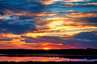
| Buffalo Trail | | |
|
 |
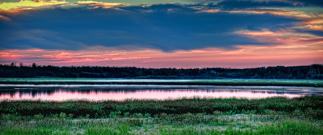
| Lake Tawayik |
|
In this post I am going to share my process for making the above image (Click on any image on this page to enlarge it).
In order to do that I first need to set the scene. The day was fairly overcast but there were many breaks in the clouds. There were spots of blue sky and there were spots of storm clouds. I really good mix in the sky. I was at work and when I looked outside I kept saying to myself that I hope this sky will hold till sunset. I find that sunsets have more impact when the clouds are scattered and broken up. The sun was supposed to set at 9:45 so I planned to be at the site for 8:30. I wanted to be at Elk Island Park over one hour early because I wasn't familiar with the area so I needed to have time to find a good spot. After parking the truck at 8:30 it took about 30 minutes to walk to the south east side of the lake. This gave me about 45 minutes to pick a good spot. This became rather difficult. Much of the brush was high. Too high even for my tripod. Getting close to the water was not possible. I wasn't able to walk into the marsh without having hip waders which I don't own. I managed to find a ridge that got me high enough to get the lake in with the sunset in the background (Lake Tawayik). After the sun went down I started walking back towards the truck. The walk consisted of walking on a trail in the marsh that was made by buffalo. Walking on that trail I noticed the sky change to a strong pink hue. I decided to find a spot to set up the tripod and take some more shots. Again I had to find a spot that was a bit higher up because there was tall grass along the trail. So now I will start getting into the details for shooting and processing Buffalo Trail.
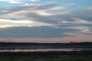 |
| DEW5571 |
The sky was still pretty amazing so I wanted to get as much sky in the shot as I could. I also wanted some foreground element and the nice reflections in the lake. DEW5571 shows you how I framed the shot. I am shooting with a Nikon d300 and a Nikkor 50mm f/1.8 prime lens. My tripod is an Induro Adventure AKB2. I did not use any filters for this shot. I always shoot in raw. The camera settings are as follows:
Aperture Priority
ISO: 100
Aperture: f/8
Exposure compensation: -0.7
Bracketing: 9 @ 1/3
With the Nikon my metering is set to matrix metering and my point of focus is the red square in DEW5571. I chose this point of focus for a few reasons. Firstly, it was far enough away that everything would be in focus at f/8. Secondly it is basically the midtone as far as the lighting in the scene. I then press my menu button on my Nikon. Select Interval Timer Shooting. Select Now. Put in a second value. I have been using 15 sec. Then 001 x 9 = 0009. Select On. Then press OK. This will fire off the 9 shots for the bracketing. Keep in mind this is only for certain models of Nikon's and does not apply to all. Some models are only capable of 3 image bracketing. Check your camera manual. Not all cameras have the interval timer built in either and these two options are the big reasons I chose the camera I did.
Now back at home I copy my images from my memory card onto my computer hard drive. Some people like to use import software but I guess I am old fashioned and I just copy and paste them into a folder of that days date. Once all the images are on my hard drive I then use the import function in Lightroom. I then select the images I want to use and export them using export options that convert the raw files to tiff with no compression. Once exported the tiff files are automatically opened in Photoshop. This is a setting I have turned on in the export options of Lightroom. I then use Noise Ninja to denoise each of the 9 images. I save each of the files as tiff with no compression. I like to denoise early in the process because when using HDR software noise can be amplified by the software.
 |
| fig1.0 |
I then open up Photomatix. Select Load Bracketed Photos. When the dialog opens select the tiff files. After selecting the images you will then get this dialog box (fig 1.0).
 |
| fig 2.0 |
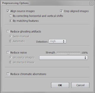
I don't use any of the reduce ghosting or noise here because I take my photos on a tripod. If you use handheld bracketing you may want to select the reduce ghosting. I pretty much leave these settings the same all the time and they are set as you see them in fig 1.0. Once you click OK the software will begin to process the images you have selected. This can take some time depending on your computer and the size of the images. Once it completes you will see an image on the screen that to me typically just doesn't look right.
 |
| fig 3.0 |
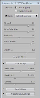
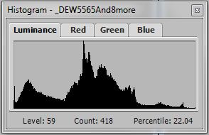
Well that is because you are not done. At this point you need to select Tone Mapping. Once you do you will be faced with many more options. I will be honest when I first started messing with this software I was rather confused by all the sliders and pull down menus. After a ton of messing around much of it started to make sense and it became easier to process my HDR's. You will see your image on the main screen. You will have your settings adjustments on the left (fig 2.0) and you will see a histogram floating about somewhere (fig 3.0). The histogram can be moved around. I put mine in the lower left so it sits right under fig 2.0. I used to just close it because I didn't know what it was for. Believe me when I say it is actually really important. When the luminance tab is selected on the histogram it basically gives you a report of the exposure levels. If too much black graph is on the left side of the histogram your resulting image will be too dark or have too much black. If there is too much on the right side then your image will be over exposed or have too much white. So when you adjust your settings in fig 2.0 you need to pay attention to how making changes there changes your histogram. The settings in fig 2.0 can get pretty complex but I have my preferred settings that I like to use. I almost always use the tone mapping process. Method is usually set to details enhancer. I typically have my strength set to 80. I used to use 100 but have since brought it down. This is a preference as is with all settings. Play with it to find what you like and establish your own style. Color saturation will vary from image to image. My typical range is from 60-80. It really depends how much color I want in the resulting image. You can also do black and white HDR by setting this to 0. Luminosity is almost always set to 0 and microcontrast to 8. Farther down you will notice gamma and it is usually at 1.10. I skipped over some of the settings that are showing in fig 2.0 because they are more complicated and I will explain them in more detail. In the tone settings tab if you click it you will find settings for white point and black point as well as gamma. I use white point and black point to adjust my histogram. If you decrease these settings you will see on your histogram that the amount of white or black will change. In the above example you will see that fig 3.0 has very little white which is represented in the graph by the right side. Before adjusting the white point to 2.0 there was even less. Adjusting the white point up will amplify areas that are more exposed. What I mean is that of the 9 images that I put in at the beginning certain images are more exposed. By adjusting the white point you make your resulting image have more or less of those images that are more exposed. Inversely by adjusting the black point you are bringing more of the under exposed images into your resulting image. Your best bet is to have very little white and very little black. Adjust your sliders to make this happen and keep and eye on the histogram. Also as you make adjustments you will see changes in the resulting image. For Buffalo Trail the settings you see in fig 2.0 were used. One thing to note is that the preview image that you see isn't exactly what your resulting image will be. If you mouse over the preview image you will notice your mouse pointer will generate a box around it. If you then click on the preview image you will get a loupe window that pops up and that is a more accurate view of what your final result will be. Once satisfied with your settings click on process in the lower left corner. It will take a bit to process your image. Once it is complete click on file and select save as. I save my image as a jpg at this point.
 |
| fig 4.0 |
|
 |
| fig 5.0 |
|
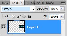
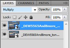
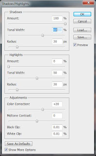
I then open up Photoshop. I select File - Open As Smart Object. Then select the jpg I saved from Photomatix. Once it opens I select Layer - Duplicate Layer. I then change the layer mode to multiply (fig 4.0). After doing so I then select Image - Adjustments - Shadows/Highlights and make the adjustments shown in fig 5.0. After clicking OK you will notice your image gets much darker. This is ok because we brighten it up in the next step using an adjustment layer. This is basically the point where creativity really takes over and you have to know what you are hoping to accomplish. Much of which I have shared to this point I have learned from others that have shared their secrets. Trey Ratcliff and Genia Larionova have shared much and if you are on Google+ I highly recommend following them.
 |
| fig 6.0 |
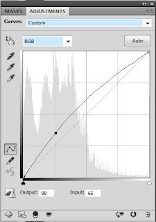
So now we brighten up our image that we just darkened. I know that doesn't seem to make sense but hopefully I can explain why. Click on Layers - New Adjustment Layer - Curves. When you do a new box will open up. It will look something like fig 6.0. The box will have a faint histogram in the background and a line running across it. You can click on the line and while holding down the mouse button you will actually create a curve. While doing this you will notice that your image will get lighter or darker. If you pull the line up and to the left it will get brighter. In fig 6.0 you can see the original straight line and the curve that I created. You can also see a dot on the curve and that is where I clicked on it with the mouse pointer. You can click on multiple areas on the line and adjust in various directions. This is totally preference and is most likely going to be different depending on the image. When adjusting the curve you may notice that there are certain areas of your image that benefit from brightening and some that don't. What you can do is adjust the curve to brighten the areas to a level that you want. Then you mask out the stuff that you don't want lightened using a layer mask. This was a bit confusing to me at first but after watching a few videos on Youtube it became rather easy. You can also create multiple curve layers each with different adjustments and layer mask them accordingly.
 |
| fig 7.0 |
|
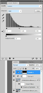
The next step basically puts in some contrast. It is also a layer that usually requires a layer mask. Especially if there are a large amount of clouds in your image. I find that too much contrast in clouds makes them look fake or just not good at all. Select Layers - New Adjustment Layer - Levels and you will get a new adjustment box open up. Again you will see a graph. Under the graph there are 3 pointers. You can slide those pointers and in doing so you will change the contrast of your image. Fig 7.0 shows the adjustments I made for Buffalo Trail and if you look under the levels adjustment you will see the layers on the image. You can see on the levels 1 layer that there is a layer mask the is almost all black except for a small amount of white at the bottom. What this mask is doing is making it so that the bottom of the image has the contrast adjustments and the top doesn't.
From this point I will typically either add other layers or flatten the image. Sometimes I add a layer to adjust Hue/Saturation or Exposure. I will most often add filters from Topaz Adjust. These are all preferences and I may at some point create a tutorial for those additional steps.
 |
| fig 8.0 |
|
 |
| fig 9.0 |
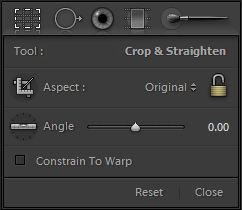
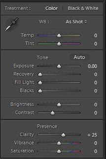
After all the layer work in Photoshop I will then save the image again and bring it back into Lightroom. At this point I will do my cropping. For this particular shot I had to straighten the horizon and I did a custom crop by changing the aspect to 2.39 to 1. By clicking on the square in fig 8.0 you open the crop adjustments. Use Angle to straighten the horizon. To change the aspect to 2.39 to 1 you click on the down arrow beside Original. Then select Enter Custom and type the numbers in. The aspect is like a fake panorama and I learned about this from Scott Kelby by watching his show The Grid so I decided to try it out on this shot. Next to the crop tool is the spot removal tool. I used this quite a bit in this shot. I removed many birds, weeds, and various other things that I felt took away from the image. Try to get rid of stuff that takes your eyes away from the main focus of the image. There are other settings you can adjust in Lightroom and for most images I do. However, with this shot the majority of the work was done in Photoshop. I added some Clarity for this shot. It wasn't much. Mostly because I wanted the shot to be smooth and soft. Other work that I have done I have pushed the Clarity up much higher. Typically I will add contrast in the area of +25. I will usually add Blacks to +5. Again this is all preference and is going to vary depending on the photo you are processing.
 |
| fig 10.0 |
|
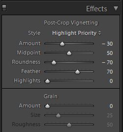
The last thing that I added was a vignette. This is a slight darkening of the outside edges and corners. I will add this to certain images in an effort to keep the viewers eyes towards the middle of the photo. I do this using the Effects section and you can see the settings I use in fig 10.0
That basically wraps it up for the process that I use. I did leave out some steps regarding Topaz Adjust and I left that out because it's pretty complicated to explain. If you have and use Topaz, I will usually add a color blast layer but I will reduce it's opacity to about 55%. I usually will add a mild details layer as well. The opacity of that layer will depend on the shot and for a shot like Buffalo Trail I will mask out the layer in spots were I want things to be smoother like the water.
If you are interested in a print of Buffalo Trail or just want to see some of my other work feel free to visit my website:
http://waddingtonphotography.smugmug.com/
Software Used:
Adobe Lightroom 3.0 -
http://www.adobe.com/products/photoshop-lightroom.html
Adobe Photoshop CS5 -
http://www.adobe.com/products/photoshop.html
Photomatix Pro 4.0.2 -
http://www.hdrsoft.com/
Noise Ninja 2.3.6 -
http://www.picturecode.com/
Topaz Adjust 5.0 -
http://www.topazlabs.com/adjust/
If you have any questions regarding this process feel free to leave comments here or you can find me on Google+ as +David Waddington .